Suboodle
A subscription based caboodle. Helping users unsubscribe, view their spending and track their subscriptions on all service provided platforms.
-
Design a mobile-friendly version of the company’s product that will significantly increase their market reach (with more than half of potential users on mobile devices). This will ultimately result in more users and more business.
Current users want to see all of their subscriptions in one place to get a comprehensive view of their spending on subscriptions.
Returning users want to unsubscribe from subscriptions so that they can reduce needless spending.
Consumers want to be notified if any subscriptions are about to be auto renewed so they can make a decision about whether they want to renew the subscription and continue spending money.
-
I participated in this project by conducting a competitive analysis, recruiting, surveying, sketching, wireframing, usability testing, Lo-fi prototyping, Hi-fi prototyping, synthesizing all results.
-
Making a mobile device interface to display a task that is usually tedious for a user to view and turning that into something more engaging, while keeping the functionalities of a professional financial site.

Research.
Research was conducted with competitive analysis of other financial sites and subscription tracking applications. Leading to a census of those sites trying to feel friendly and warm when dealing with finance.
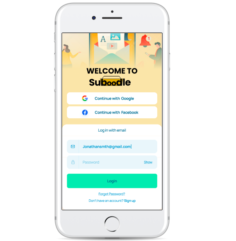
Most of the sites required users to link a bank account before even starting with their product. This can deter their users from moving forward with their service, this was shown through the survey that was conducted.
Many participants in the survey did not want to link their bank accounts to companies or share their data.
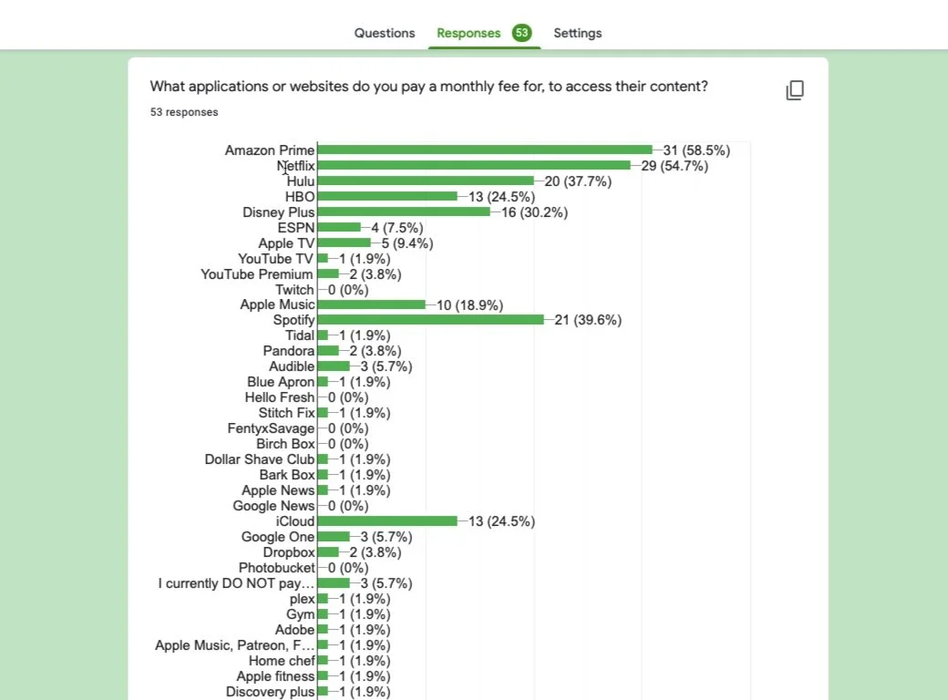
Survey.
There were 53 respondents for the survey, which led to recruiting 10 users in total for Low Fidelity and High Fidelity usability testing.
The survey showed that most people have more than 2 subscriptions and do not use any subscription tracking. Regarding people's spending habits, people fall within the often to sometimes range.
This is good to know because people may not track their subscriptions however they do recognize their spending on these subscriptions. It shows that there is a market for this type of service.
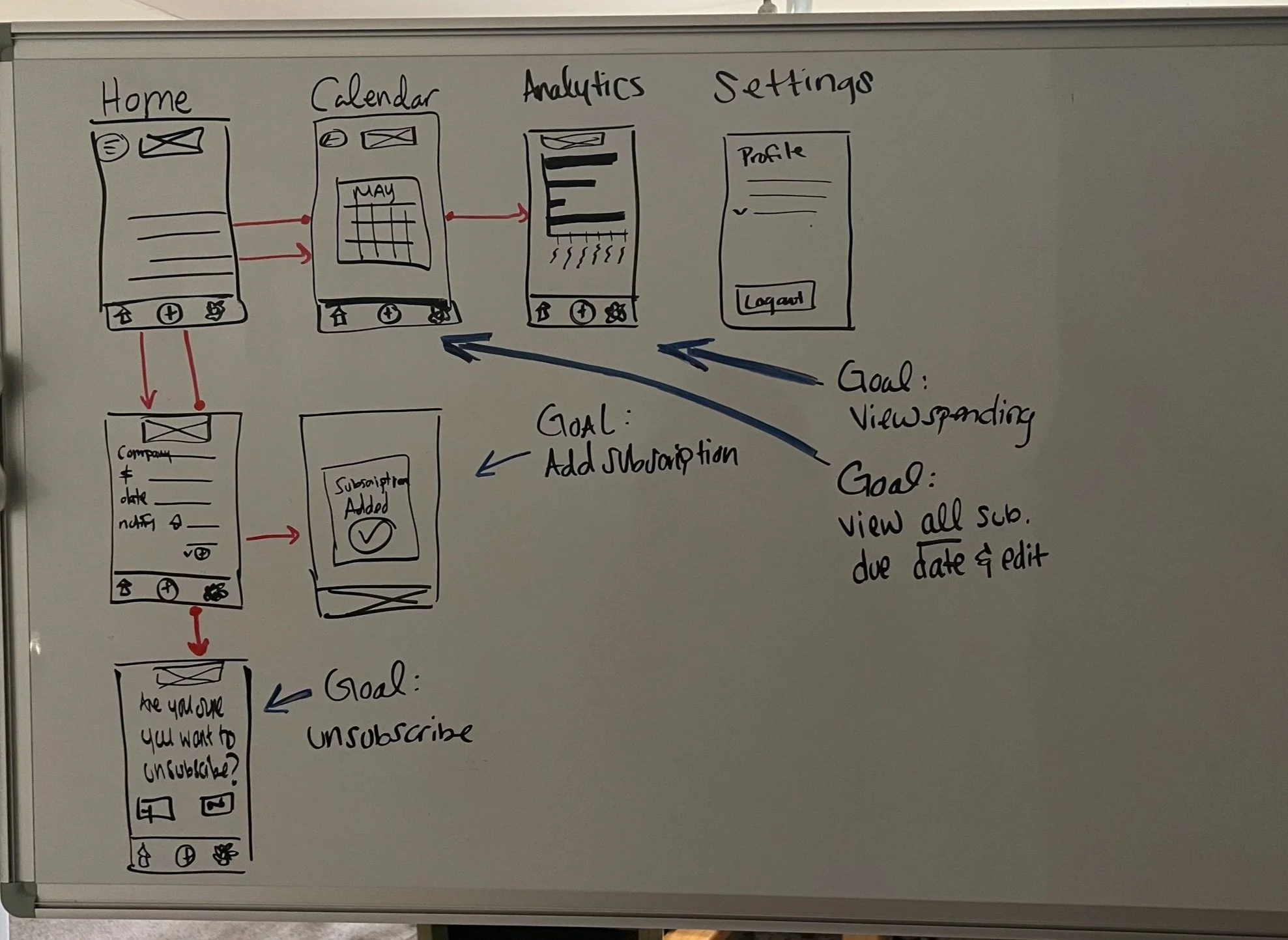
Sketching.
Sketching a few screen outlines was necessary to map out possible routes a user would take.
Keeping in mind the goals of the user when using a financial application to solve problems such as how the user would view their spending, add a subscription, unsubscribe and view all due dates and renewals.
Discovering the next steps of screens including confirmation of an action were sketched out.
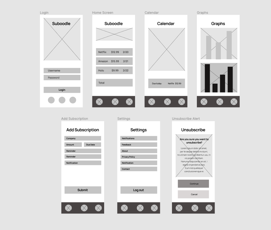
Wireframes.
Wireframes were made to structure and get a sense of flow from screen to screen that would be needed for users.
Other screens were added later on to expand on the processing of what the mobile site will provide and where it should be placed.
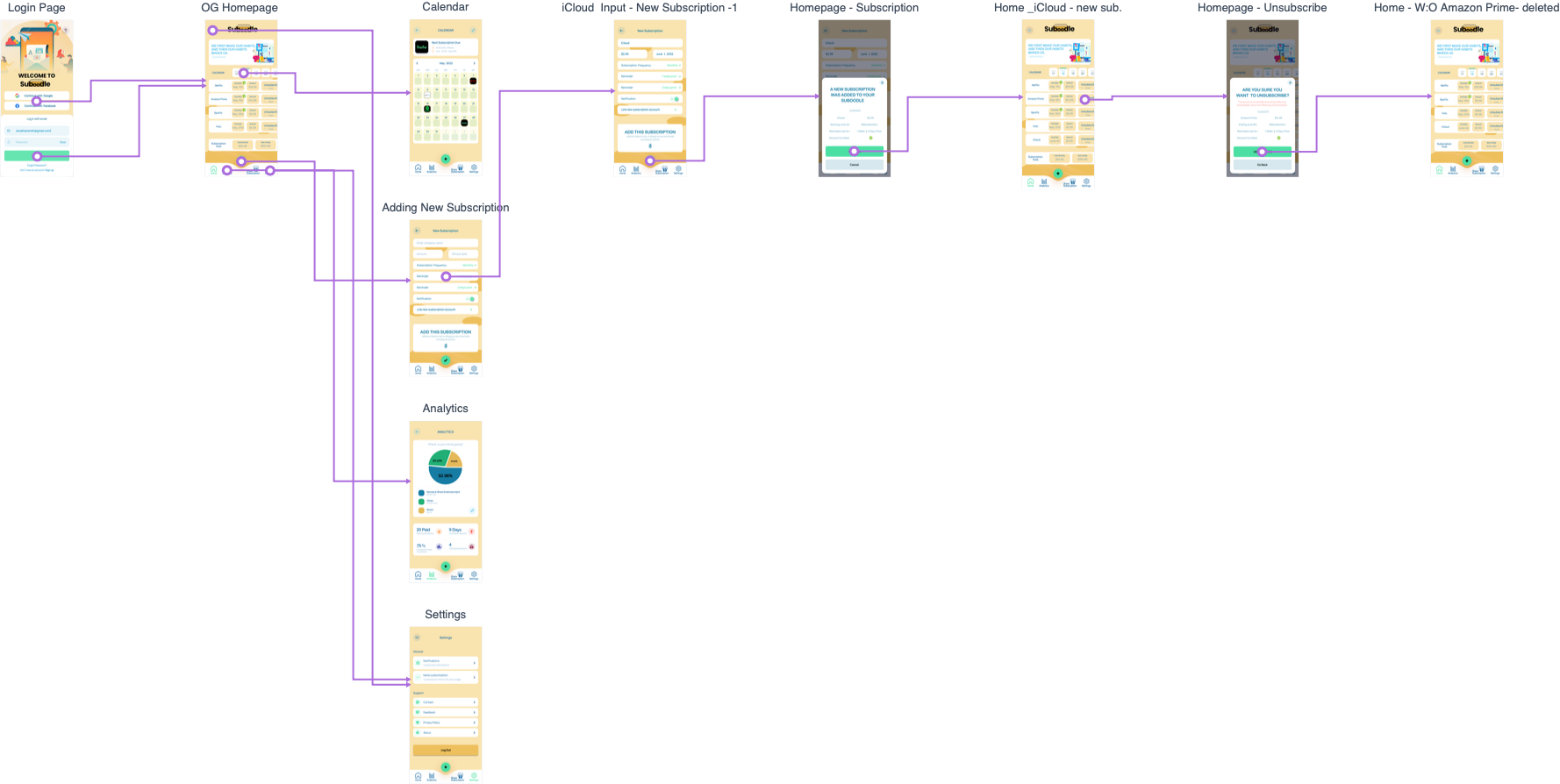
User Flow.
The first version of the Low Fidelity User Flow Map shows the process of the user wanting to add a subscription going back to the home screen then unsubscribing from a different subscription. These two MVP’s are the top priority services that Suboodle provides. The goal in this phase was to make sure that there was a consistent flow between screens and that all screens were evaluated to make sure they served a purpose.
Lo-Fi Testing.
Testing the low fidelity screens with 5 participants varied when discussing the findings.
The most challenging decision being that two participants saw that they wanted to link their account to the app, so the app can sort out what subscription categories the users spend on.
However, 3 other participants liked that they don't have to link their bank account to the app to use the service, since they are afraid of data leaks and their information getting out.
This led me to decide there should be an option to link accounts in case some users don't want to connect their bank accounts or subscription accounts.
Nevertheless, without that connection to the users subscription accounts then the service provided will not be used to its fullest potential.
Hi-Fi Testing.
After testing five participants in a usability test the users wanted to unsubscribe by tapping rather than swiping when on the homepage, many noting that they didn't notice the swipe signals or wording. However once users discovered they needed to swipe to unsubscribe many liked that idea so that it wouldn't be as easy to accidentally unsubscribe.
Along with that, the wording seemed too abrupt to unsubscribe immediately and users said they would like to have some sort of email to note for their records with exact dates their subscription would expire.
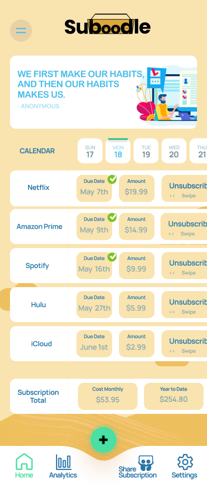
Lastly, a user said that they wished there were categories on the home page to see past and future billings for the subscriptions.
The next iteration then included two separate drop down menus providing all past billings and current due billings, allowing the user to view what they choose on the home screen.
In Conclusion
-
The users can now use a mobile friendly design to keep track of all subscriptions in detail knowing the due date, past billing, future billing and amount. The user can also unsubscribe with a swipe allowing easy cancellations that are documented.
Next Iterations:
Because a good majority of participants noted that they used other people’s subscriptions, I think incorporating “share a subscription” would be great to include in the next . This would be helpful to users to share with family and close friends without giving them the main password and username and also keeping track of who is using their subscription. This feature can allow the main profile user the access to cut people out from using any platform they share. However I could see this being a problem with other companies who benefit from the users subscriptions.
-
When conducting usability testing your findings through interviews can be split. The challenging part is to know what to do when this comes up. In this case I took both disagreements regarding liking a bank account and incorporated them into being an option for the user to decide.
The second challenge of this project was working alone. Being able to get another perspective of the color palette making sure that it was gender neutral, the typography was readable with the different types of fonts. I veered away from pinks and purples so that the color palette wouldn’t seem too feminie. Instead, I incorporated green and blue to be more gender inclusive.
-
I learned that asking a user how they would like to be asked a certain question on an app during the low fidelity usability testing, can be very beneficial to the high fidelity prototype. This shows how the user would like to be approached with a certain question pertaining to the app/site design.
Research surveying showed that the majority of people have more than two subscriptions and don't really keep track of their money very well. Keeping track of their money qualifies them to check their bank accounts regularly on a weekly basis. When in the past it was qualified as balancing your checkbook and knowing where every cent is going towards.