House2Home
A website that assists customers in buying a home decor starter kit for their new place.
-
Customers want to achieve a certain style however, they also want to stay within their budget. The problem with shopping for one item at a time is that they don't know if each item will collaborate nicely within their space.
-
An end-to-end process consisting of competitive analysis, storyboarding, user insights, sketching, prototyping, user interviews, user flows, information architecture of the MVP, UX low-fi design wireframes, & final UI wireframes for website.
-
The solution was a step by step process that takes into account the style, the room, and the customers budget. After being carefully calculated with the information they are given a list of suggestions. The customer then has the choice to go with the suggested items or switch out an item that is equal in value. This provides an interior designer service to all customers, no matter the cost.
Research.
Information and constraints were provided regarding House2Home.
This e-commerce site sells home decor items and accessories like prints, lighting, accent pieces, etc. Through customer surveys, they found that their customers have just moved into their new space; however, they don't feel comfortable personalizing it on their own. House2Home saw an opportunity to help customers find a “starter kit” of items to decorate their new place.
Constraints consisted of there needing to be multiple products in the starter kit, each item varies from $10 to $50 each. They d not sell large furniture pieces or appliances and the design had to be a desktop or laptop design.
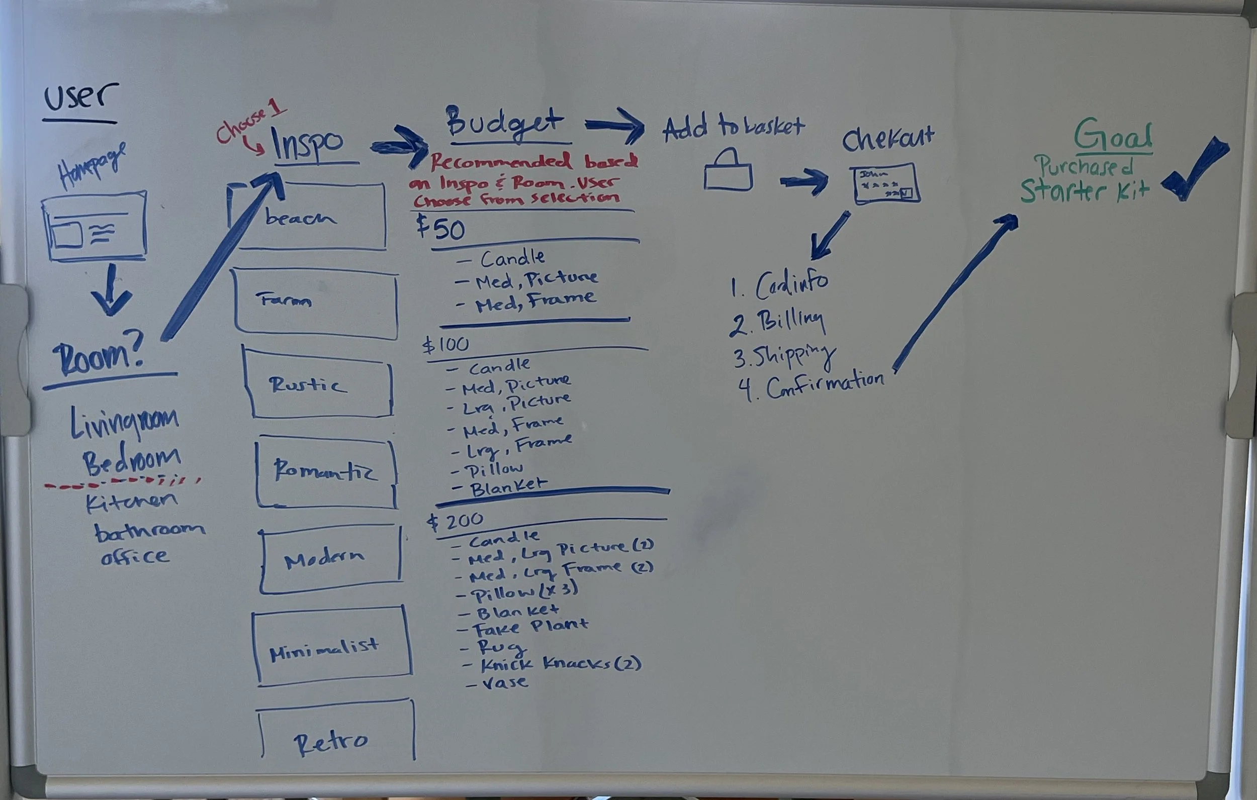
Day 1 Map.
The end goal was to have the customer proceed to checkout with a starter kit.
After calculating risks and “How Might We” (HMW) questions, many lightweight journey maps were created. However, considering the end goal and constraints, this map was chosen to go forward with the design process as the solution due to it answering many HMW questions and adding equal reward compared to the risks.
Five participants were recruited on this day for user interviews for day 5 (testing) of the design sprint.

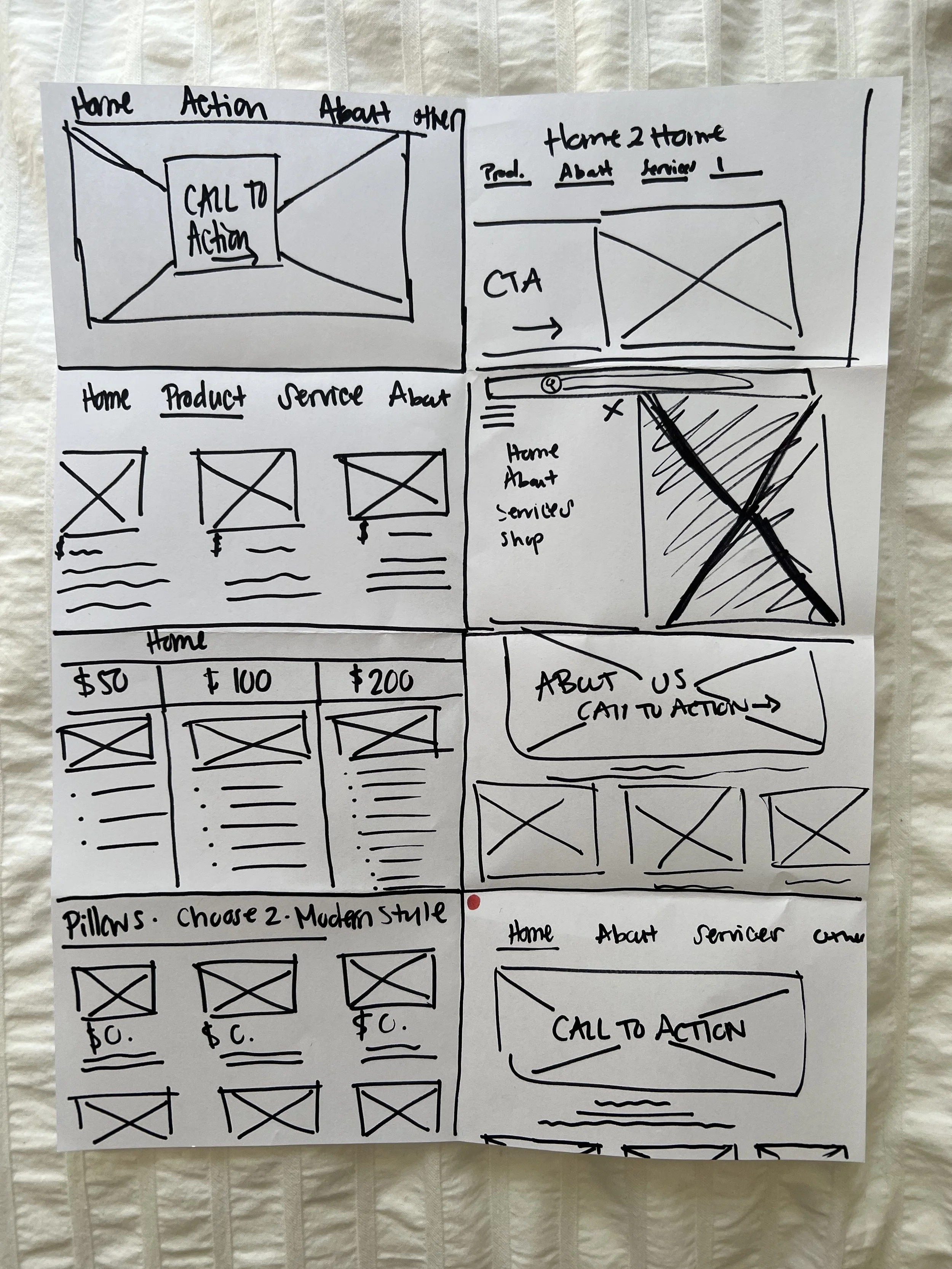
Day 2 Sketch.
Started with a lightning demo of light competitive analysis looking at Ikea, Crate & Barrel, and Nest & Set. Ikea is known for having decor and furniture for a low budget yet decent quality. Their site gives users the idea of a “feeling” they are wanting to achieve in a room and gives the opportunity to use a 3D model.
Crate & Barrel sells quality products with a high price. Their website advertised heavily on speaking with a free professional interior designer for advice. Another option was for customers to use their easy to use 3D model that was a pre-uploaded design or could be self-made.
Nest & Set is an e-commerce site, selling bundles to decorate a home. The bundles were advertised to be around a certain price point. However, they were 3x the price point when at checkout, destroying the trust between customer and company.
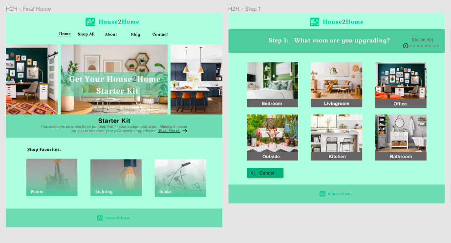
With all the great qualities of each site in mind, an activity of crazy 8’s was conducted to brainstorm screens for House2Home. The best design that was created for the Home Screen, gave the users a call to action, along with what House2Home does as a service below the main photo.
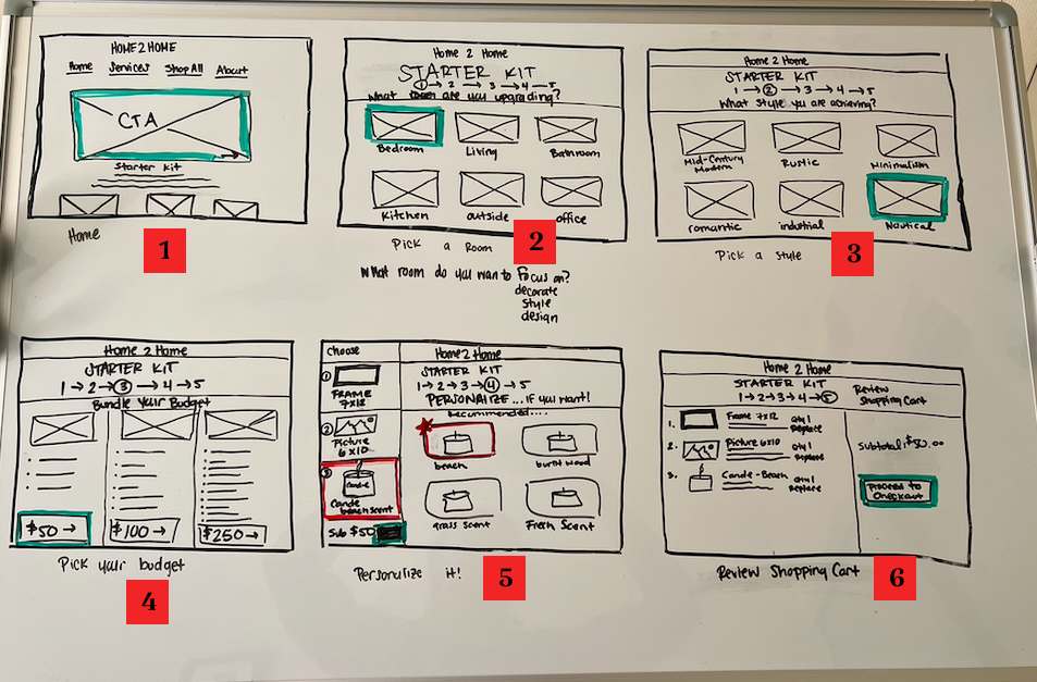
Day 3 Decide.
Decided on the layout of the screens, to achieve the goal of the user checking out with a starter kit.
Each screen requests the user to make a decision for a recommendation to be given.
Screen 1 is a call to action and home screen for the user.
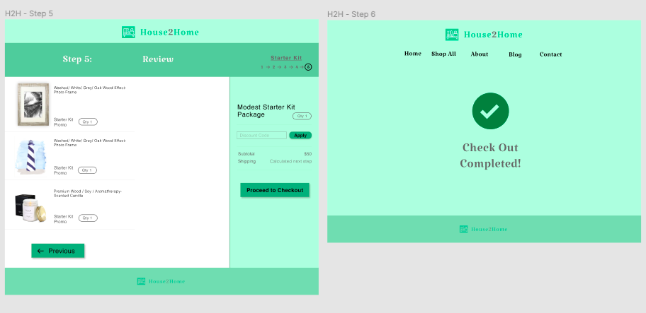
Screen 2 gives the user an option to focus on what room they want to decorate.
Screen 3 allows the user to choose what style they want that room to be.
Screen 4 gives the user an option what bundle they would like that best fits their budget. Detailing what items are included in each bundle.
Screen 5 takes in consideration the room, the style and the budget. Giving the user the selected items that best fit their needs. The customer at this point can either go with the recommended item or they can choose a similar item of equal value.
Screen 6 is an item list and subtotal review of what is going to be processed during checkout.

Day 4 Prototype.
The goal for testing this prototype was to make sure that each step through the process made sense to the user.
What was to be learned through prototyping was to determine which screens served no purpose and what could potentially be needed in the next iteration.
The prototype created is a basic function of the House2Home website with the one user flow resulting in seven screens; from the homepage to checkout. Each screen when starting the starter kit provides a “Step” number in where they are in the process and a call to action.
Day 5 Testing.
User interviews were conducted with five young professionals that were between the ages of 25 to 31, all of them had experienced moving in the last 4 months. The most common sites that were mentioned to be used when looking for decor were Amazon and Wayfair. All users said that they look at both quality and cost when thinking of a purchase, one user stated “Can I justify the price for the quality of it”.
When asking the users for their first reaction regarding the homepage, three of five participants said that they wanted to scroll more to see other categories to shop and connect socially with. This was a good sign, knowing that users wanted to see more interaction from the website and wanted to shop in other categories.
All participants showed that from the home page to checkout was very easy and self explanatory to use. There was no confusion throughout the process when wanting to checkout. However when on step 4, to personalize the package, many participants did not know that they could swap out an item for another item that was equal to its own in the same category. Next time when doing a user interview for this prototype I would give them at least 4 separate tasks, one for each screen step.
Lastly, four out of the five participants picked bohemian style rather than the nautical style when prompted to pick beach themed during a task. One consensus for this is because the nautical picture did not seem “beachy” themed enough, and in fact to most of them they feel like bohemian is more beach themed from their own experience.

In Conclusion
-
The user can now have a pleasant experience with being provided an interior design service on their own, knowing that it is within their budget and style.
Next Iterations:
For the next iteration, I would include a zoom magnifier pop up feature on Step 4, this is where users are able to personalize their items. I would incorporate this because during the user interviews most users were shopping for quality as well.
In the user interviews, many suggested that they would like to see picture examples of the items during step 3, when picking a bundle/budget. Due to that screen only stating in writing what was included.
-
The main challenge for me was knowing that it was a 5 day accelerated process, making me become anxious before even starting. While in fact, I enjoyed this design process alternatively because of the daily progress shown and not allowing anytime to linger on a decision.
-
I learned that looking at other companies on how they design in the same industry can be very beneficial to what I personally design.
While conducting user interviews, I thought that many users would choose nautical as a “beach theme” when prompted during a task. I was surprised with the fact that most users chose bohemian instead, users stated that nautical to them is a beach house. What I took away from this is researching “themes” is not the same when applying it to a style of a home.